B2B Campaign Design: Landing Page Design Best Practices
This is part 1 of 3 in our B2B campaign design series. This post explains how to design landing pages, part 2 covers banner design, and part 3 explains how you can optimize campaigns based on your results.
The heart of any marketing triumph is a well-orchestrated campaign.
glassCanopy defines a campaign as an organized set of tactics promoting a call to action that drives lead generation. A campaign is composed of banners that promote your product across a range of platforms (retargeting, paid social media, etc.) and accompanying landing pages where prospects actually convert.
In this post, we’ll explain how to design an effective landing page, including:
- The main design elements
- What these elements can achieve
- How to position each element
Want to learn more about B2B content marketing?
Download our comprehensive 20-page guide.
B2B Campaign Design Tips: Landing Page Elements
Even though prospects see a banner before a landing page, we like designing the landing page first. It provides additional details about what the banners are promoting, so having a finished landing page to slim down into banners simplifies the design process.
We break down our landing page designs into 3 sections:
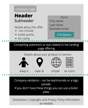
Hero
The hero is the most critical section of the landing page. In some cases, prospects may not even scroll down to look beyond it. This is not the place to use extensive detail to sell your company or product—that’s what your website is for. Here, you’re just trying to get people to convert.
The main conversion opportunity needs to be in this section, positioned above the fold (above where the browser/screen ends without scrolling). Prospects will choose to convert based on the information that is here—the rest of the page can support the call to action, but you don’t want to rely on it. The hero should include:
- A Form: Forms deliver you the information needed to successfully follow up with a lead and facilitate the marketing-sales handoff process. For a smooth user experience, we limit our forms to just 1 field (usually business email) for content campaigns and a max of 3 fields (name, company, business email) for demo campaigns. Keep in mind you don’t want to ask for too much information or it can deter people from converting. Whenever possible, just use the singular business email field and enrich the data later in your CRM.
- The CTA: The call to action includes the text above the form and the button that comes after. The text above the form is a single-sentence statement about the offer, and the button indicates what the user will receive. Here are a few examples:
| Offer | Button |
| Want to see [insert product or solution] in action? | Get a demo |
| Give us just 20 minutes to show you how we can improve [insert problem]. | Let’s talk |
| Check out our eBook to see how [insert solution] helps [insert problem]. | Download Now |
Pro Tip: Keep landing pages simple and contained.
You want to create a smooth user experience. Users shouldn’t have to click through multiple screens to access the CTA they came for. The main form and CTA should be kept above the fold so visitors can quickly fill out their information.
You also want to keep landing pages contained, that is, don’t encourage users to wander through the main website by including the standard menu navigation. Keep prospects focused on the CTA. If you want to link back to your website, we recommend embedding a hidden link into the logo.
Mid-Page Support
The middle of the page is your opportunity to give more detail about the product or service—but the data here should only be included if it supports your CTA. In some cases, you may not want to include this section at all. It can be standard across all of your landing pages, or it may change depending on the offer in the hero section. Whatever you put here, keep it simple. We like to highlight a bold statement or statistic, and under that, either add bulleted details about the eBook/webinar topic, or list product features presented with icons.
Validation and Footer
The footer is typically standardized across all landing pages, based on product or industry. This is where you include company validation and information. Validation can be customer quotes, awards, or a logo parade. You can also include your company’s boilerplate or a small blurb about what you do. At the very bottom of the page, include all the legal stuff that is required like copyright notices and a link to your privacy policy.
Next Step: Banner Design!
Once you’ve designed your landing page, you can move on to the next element of B2B campaign design—banners!
Once the entire campaign is designed, it’s time to launch! How and where you launch will depend on your audience and specific product. It will take some A/B testing and review to figure out what works best. And don’t forget, the best platforms for B2B campaigns will be slightly different than those for B2C products (here are our recommendations).
After you’ve launched, be sure to make time for reviewing your landing page for optimization. Maybe the UI isn’t as clear as you expected, maybe some copy can be edited to increase the ad score, or maybe the CTA language needs to be updated. There’s always room for improvement, so take the time to step back from the campaign to evaluate its performance and make updates as needed.
Ready to get started with B2B marketing but don’t know where to start? We can help.

- Medical Marketing SEO: Using SEO to Target Doctors and Healthcare Professionals (+ Checklist) - December 4, 2023
- Marketing to Dentists: How to Market to Dentists - August 8, 2023
- HCP Marketing Trends 2023: 23 HCP Marketing Stats for 2023 - November 30, 2022